Kitsap Home Value
I am still looking at home value data. I haven’t quite gotten what I’m going for yet, but this stuff is fascinating. Now, looking a little smaller within county.
Here, I recreate a compelling image in Kyle Walker’s Analyzing US Census Data: Methods, Maps, and Models in R - this book is finally available in print. I highly recommend buying it - supporting Kyle with his work.
I innovate (VERY MINORLY) on his example in the book in section 8.2.1 by looking at the same place over time and binning my scale to make the comparative visuals meaningful. Interestingly, the example that I pull here is one that he starts with to lead the reader off to consider the distribution of the data and handling skewness. Instead of following him down that path, I go a different direction, to see how the distribution changes over time.
First, I get the data for the 2016 5 year Ammerican Community Survey at the tract level for Kitsap County - our tracts are small enough that data in the 1 year estimates are either not available or have very wide margins of error, the 5 year estimates are still estimates with error, but it is less so with 5 years of data.
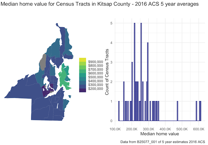
In 2016, ignoring the high outliers in Bainbridge, the middle of the rest of the distribution is around 250K.
Then, with the same places 5 years later, we get a different picture - still skewed with outliers in Bainbridge - but the middle of the rest of the distribution is maybe 375k. Note that the CPI says the difference is 10% ($1 in 2016 is $1.1 in 2021), so a small portion of this can be attributed to core inflation (note: I have a fundamental problem with this approach since it does not seem to account for much.)
What I find really fascinating here is that we are talking about median home values over 5 years - the 2016 values are 2012-2016; 2021 values are from 2017-2021. The median jumped nearly double on Bainbridge Island in these five years - and it was not all during the most recent jump in housing prices. I cannot imagine what this looks like in a few more years.
The greyed out parts on Kitsap maps are military.
Feel free to use the code below and make it your own. It’s a little sloppy, but it works. If you have improvements or other insights, I’d love to hear them!
library(tidyverse)
library(sf)
library(tigris)
library(tidycensus)

# first get the data

tract_value_data_16 <- get_acs(
  geography = "tract",
  variables = c(
  median_value = "B25077_001"),
  state = "WA",
  county = "Kitsap",
  geometry = TRUE,
  output = "wide",
  year = 2016
) %>%
  select(-NAME) %>%
  st_transform(32148) # NAD83 / Wa

tract_value_data_21 <- get_acs(
  geography = "tract",
  variables = c(
  median_value = "B25077_001"),
  state = "WA",
  county = "Kitsap",
  geometry = TRUE,
  output = "wide",
  year = 2021
) %>%
  select(-NAME) %>%
  st_transform(32148) # NAD83 / Wa

tract_value_data_21 <- erase_water(tract_value_data_21, area_threshold = 0.9)
tract_value_data_16 <- erase_water(tract_value_data_16, area_threshold = 0.9)

## make the graphs
library(patchwork) # allows combining plots
mhv_map16 <- ggplot(tract_value_data_16, aes(fill = median_valueE)) +
  geom_sf(color = NA) +
  scale_fill_viridis_b(labels = scales::label_dollar(),
                       breaks = c(200000,300000,400000,500000,
                                  600000,700000,800000,900000),
                       limits = c(0,1000000))+
  theme_void() +
  labs(title = "",
       fill = "")

mhv_histogram16 <- ggplot(tract_value_data_16, aes(x = median_valueE)) +
  geom_histogram(alpha = 0.5, fill = "navy", color = "navy",
                 bins = 100) +
  theme_minimal() +
  scale_x_continuous(labels = scales::label_number_si(accuracy = 0.1)) +
  labs(x = "Median home value",
       y = "Count of Census Tracts")

mhv_map16 + mhv_histogram16 +
  plot_annotation(title = "Median home value for Census Tracts in Kitsap County - 2016 ACS 5 year averages",
       caption = "Data from B25077_001 of 5 year estimates 2016 ACS")

# and now 2021 (could have made a function, but copy and paste is so easy, right?)
mhv_map21 <- ggplot(tract_value_data_21, aes(fill = median_valueE)) +
  geom_sf(color = NA) +
  scale_fill_viridis_b(labels = scales::label_dollar(),
                       breaks = c(200000,300000,400000,500000,
                                  600000,700000,800000,900000),
                       limits = c(0,1000000))+
  theme_void() +
  labs(title = "",
       fill = "")

mhv_histogram21 <- ggplot(tract_value_data_21, aes(x = median_valueE)) +
  geom_histogram(alpha = 0.5, fill = "navy", color = "navy",
                 bins = 100) +
  theme_minimal() +
  scale_x_continuous(labels = scales::label_number_si(accuracy = 0.1)) +
  labs(x = "Median home value",
       y = "Count of Census Tracts")

mhv_map21 + mhv_histogram21 +
  plot_annotation(title = "Median home value for Census Tracts in Kitsap County - 2021 ACS 5 year averages",
       caption = "Data from B25077_001 of 5 year estimates 2021 ACS")