Income v Home Value
I don’t have any particular need to look at these data, only that I am trying to get at something in my local county, Kitsap, and I haven’t quite figured out how to do that. So, I am following a lot of bunny trails on exploring geographic data.
I used the tidycensus package by Kyle Walker to simplify getting census data and mapping data, so that I could create visuals in R.
I originally was only interested in home values, but then I wanted to see how it related to income. Now, these dollar values are not inflation adjusted, but if I had adjusted for inflation on the 2015 numbers, the difference is about 10%. As in, based on what the BLS says, $1 in 2015 is $1.10 in 2020. This does matter, I guess, for the isolated graphs on home values and income, but not on the ratio of the two. [Aside: the CPI inflation adjusted dollars never make a whole lot of sense unless you are really talking about the same basket of goods IMO - I’m no fed chair or anything]
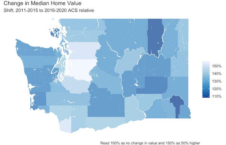
When we look at growth in home values, we can see that most grew quite a bit.
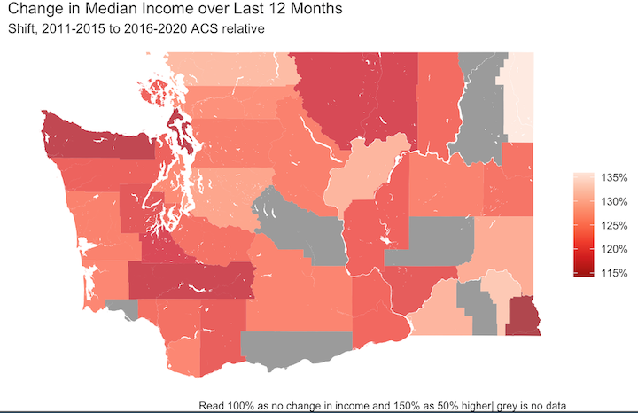
Income also grew, in many counties. The grey counties are where we don’t get estimates of income because of small populations.
The big kicker is right here, where it is obvious that home values outpaced incomes in some counties. Especially Snohomish!
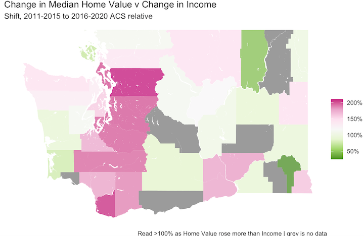
There is a lot going on here. Homes are generally not purchased by individuals, and households may be made up of several people. In addition, there are other distributions and possibly different income sources (although, ACS income question is pretty broad, unlike the BLS one.) I am definitely NOT a demographer or expert on any of this. I’m just hacking at making graphs and trying to think about them.
Feel free to use the code below and make it your own. If you have improvements or other insights, I’d love to hear them!
library(tidyverse)
library(sf)
library(tigris)
library(tidycensus)

# first get the data
median_home_value_15 <- get_acs(
  geography = "county",
  state = "WA",
  variables = "B25077_001",
  year = 2015
)
median_home_value_20 <- get_acs(
  geography = "county",
  state = "WA",
  variables = "B25077_001",
  year = 2020
)
median_income_15 <- get_acs(
  geography = "county",
  state = "WA",
  variables = "B06011_001",#"B19113_001",#
  year = 2015
)
median_income_20 <- get_acs(
  geography = "county",
  state = "WA",
  variables = "B06011_001",
  year = 2020
)
# now build a combined dataset
mih <- median_income_15 %>%
  mutate(county = sub(", Washington","",NAME),
         mi15 = estimate,
         mi15_moe = moe) %>%
  left_join(select(mutate(median_income_20,
                   mi20 = estimate,
                   mi20_moe = moe),GEOID, mi20, mi20_moe)) %>%
  left_join(select(mutate(median_home_value_15,
                   mh15 = estimate,
                   mh15_moe = moe),GEOID, mh15, mh15_moe)) %>%
  left_join(select(mutate(median_home_value_20,
                   mh20 = estimate,
                   mh20_moe = moe),GEOID, mh20, mh20_moe)) %>%
  mutate(hv_change = mh20-mh15,
         hv_p = hv_change/mh15,
         in_change = mi20-mi15,
         in_p = in_change/mi15,
         dif = hv_p/in_p) %>%
  arrange(desc(dif))

# prepare for visuals - get the map geometry
wa_counties <- tigris::counties("WA")
wa_counties <- erase_water(wa_counties, area_threshold = 0.9) # this is very important for western WA

# combine data and geometry
wa_county_mih <- wa_counties %>%
  left_join(select(mih, GEOID, hv_p, in_p, dif))

library(scales) # to be able to show percent

# create the plots
# home value
ggplot(wa_county_mih) +
  geom_sf(aes(fill = hv_p+1), color = NA,
          alpha = 0.8) +
  scale_fill_distiller(palette = "Blues",
                       labels = percent) +
  labs(fill = "",
       title = "Change in Median Home Value",
       subtitle = "Shift, 2011-2015 to 2016-2020 ACS relative",
       caption = "Read 100% as no change in value and 150% as 50% higher") +
  theme_void()

# income
ggplot(wa_county_mih) +
  geom_sf(aes(fill = in_p+1), color = NA,
          alpha = 0.8) +
  scale_fill_distiller(palette = "Reds",
                       labels = percent) +
  labs(fill = "",
       title = "Change in Median Income over Last 12 Months",
       subtitle = "Shift, 2011-2015 to 2016-2020 ACS relative",
       caption = "Read 100% as no change in income and 150% as 50% higher| grey is no data") +
  theme_void()

# ratio
ggplot(wa_county_mih) +
  geom_sf(aes(fill = dif), color = NA,
          alpha = 0.8) +
  scale_fill_distiller(palette = "PiYG",
                       labels = percent) +
  labs(fill = "",
       title = "Change in Median Home Value v Change in Income",
       subtitle = "Shift, 2011-2015 to 2016-2020 ACS relative",
       caption = "Read >100% as Home Value rose more than Income | grey is no data") +
  theme_void()